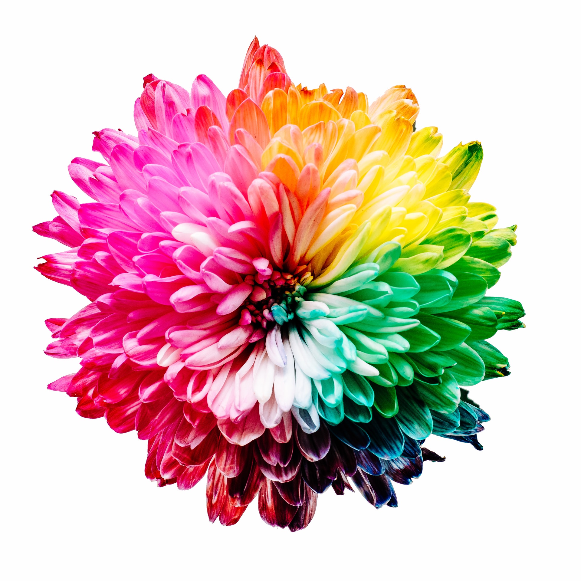
© 2020 Helen C Read
Color is pretty essential to the painter.
And the temperature of color, though often subtle, is important to understand.
There are three primary colors on the color wheel – Red, yellow and blue.Two of those colors, red and yellow, are considered warm colors. These are colors we associate with fire or sunshine.
These two colors evoke different emotions and reactions than the other primary color, blue, which is considered a cool color.
We often associate blue with water or ice.
From these three primary colors, all other pigmented colors are formulated. Secondary colors are created from mixing of any 2 primaries.
They are orange, green, and violet.
Orange, also a warm color, is a mixture of red and yellow.
Green and Violet are also secondary colors, but considered to be cool. Green comes from mixing yellow and blue, and violet from red and blue.
Subtle Differences
Colors, of course, affect one another. For example, complementary colors (two colors directly across from one another on the color wheel), when mixed together with equal value and strength will produce grays, and those grays will be somewhat different from one another because of the colors involved. So, it stands to reason that colors can lean toward a warmer or a cooler version depending on what has been mixed with it.
Here’s an example: Green when mixed with yellow (because yellow is a warm color) will cause that green to be a warmer green than the bluer green when it is mixed with blue. That bluer green will be seen as cooler when compared with the one mixed with yellow.
Another example: Some reds will tend more toward an orange-red, still looking perfectly red to the eye. But when compared to a cooler red that has a touch of violet in it, that violet-red will look a little cooler, while still looking absolutely red to the eye.
So Why does temperature matter?
The subtle differences of color are really important as you begin to mix colors. Not all blues will mix with red and get the same effects. Alizarin Crimson when mixed with Ultramarine Blue will be a very different violet than Cadmium Red mixed with Ultramarine Blue.
In fact, sometimes “mud” is mysteriously made on the palette as colors are mixed!
If a red that leans a little bit too much toward orange-red is mixed with blue, a grayed version of violet occurs. If a blue that leans a little bit too much toward violet is mixed with yellow, a grayed version of green occurs.
See more on mixing color in this short video
I love to send encouragement to artists! It’s free and it comes right to your inbox each week. Just click the button below for inspiration, tips, and encouragement.
© 2020 Helen C Read
Photo Credit – Sharon Pittaway


Comments